
KBR Brand Refresh
After a management buyout, KBR faced an identity crisis due to the departure of the previous owners, whose initials had formed the company’s name. We worked with the new owners to develop a new branding strategy that would maintain the company’s strong local reputation and relationships while updating its image for the future.
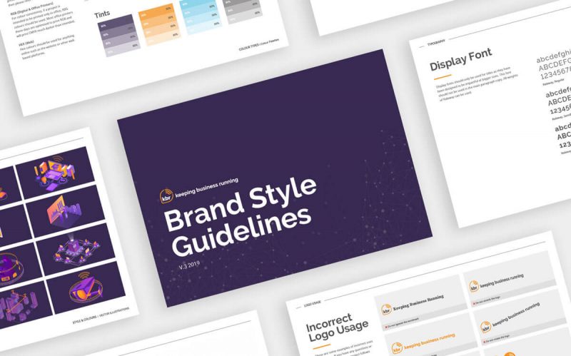
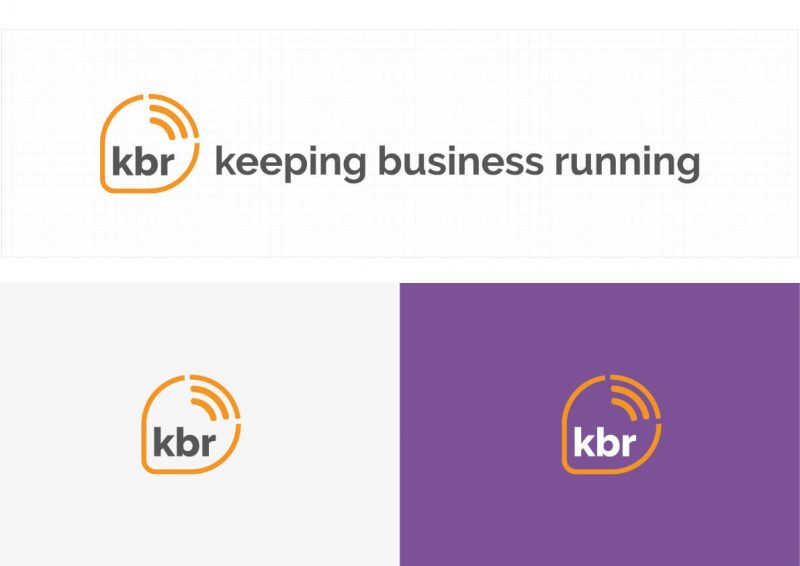
Our recommendation was to retain the KBR initials, but repurpose them to stand for “keeping businesses running,” a phrase that encapsulated the company’s focus and mission. We redesigned the logo and refreshed the branding to reflect this new direction, creating a modern and professional image that paid tribute to the company’s history. By incorporating a subtle wifi symbol into the logo through the use of white space, we further enhanced the branding and helped KBR establish a cohesive and memorable brand identity.
Project Summary
Brand Refresh
Logo Redesign
Website
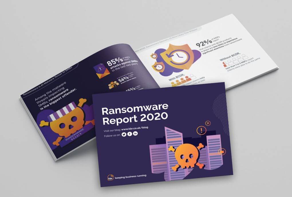
Brochures
Social Posts
Adverts
Case Studies
Videos
Office Signage
Get in touch
Don't let your design struggles hold you back. Let's have a confidential discussion about how I can help you overcome them and achieve your goals.